
Super Bowl LIV: A graphical review
Everyone has their own focal point on Super Bowl Sunday. Some viewers are there for the halftime show. Others watch for the commercials. And let’s not forget those of us who tune in to see the main event: three hours of men in brightly colored garments, pummeling each other, for America.
Those are all marvelous reasons to watch, but in my living room, there was yet another, admittedly obscure facet of the game that filled me with anticipation right up until kickoff, as I wondered, “Will Fox premiere a new suite of onscreen graphics for the Super Bowl?” The answer, to my delight, was yes.
As Kansas City Chiefs kick returner (and buffet line troublemaker) Mecole Hardman carried the opening kickoff out of the end zone, Fox unveiled its new look. It happened without an excess of ceremony, unlike everything else that day. A tight formation of parallelograms unfurled at the bottom of the screen. The words “49ERS” and “CHIEFS” glided into view and faded away, replaced by logos of the respective teams—logos so large that no parallelogram can contain them, but these parallelograms try their best nevertheless.
That fleeting glimpse of the full team names in the new score box animation is like a little farewell to Fox’s previous NFL graphics package, which was one of the rare designs to eschew the standard three-letter abbreviations (DET, CAR, NYJ, etc.). I appreciated the humane, down-to-earth vibe of simply calling the Packers the Packers, but the approach had its drawbacks. For instance, compared to other networks, it was more difficult to see which teams were playing when you glanced at a Fox broadcast from a distance. Still, on the whole, I will miss the austere sensibilities of this score box, which was one of the calmest designs in TV sports.

If the tasteful old design was an outlier, the Parallelo-Plex represents a regression to the mean, in a way. The new model is not unattractive, but it does hail from the LAND OF ALL-CAPS ITALICS, OFFICIAL HOME OF MANLY SPORTS COMMENTARY. (“IT’S A SCREAM!” —Land Of All-Caps Italics Tourism Board.) Every time I think this aesthetic is about to go out of style, there it is again.
On the other hand, while this new score box is brighter and more bombastic than its predecessor, it exercises a different manner of visual restraint: All of its crucial data points squeeze into a narrow tract at the middle of the screen, rather than sprawling to the edges as the old look did. This is a design choice aimed squarely at the audiences of 2020, for reasons I’ll explore, but its roots go back to Fox’s earliest days as an NFL broadcaster.
In 1994, the first year on the NFL on Fox, the network startled the nation with its new score box—a demure, translucent wafer. This modest bauble featured, if you can believe it, only one parallelogram! Yet many viewers considered it the height of excess. For the “Fox Box,” as it came to be known, had to be modest in appearance because it was immodest in another way: It never left the screen. Until then, the convention was to display the score only occasionally, and sports viewers can be creatures of habit. Fox producer David Hill, who came up with the idea to permanently affix the score to the broadcast, was publicly scorned by TV industry figures—most notably NBC Sports executive Dick Ebersol—and says he received five death threats from fans in the wake of the Fox Box’s debut.
Despite some initial furor, the Fox Box soon became the new normal, because it turns out people like knowing the score of a sporting event while it is in progress. The seed of Hill’s trend-setting insight was his willingness to reappraise how NFL fans watch a game. The old way—showing the score every few minutes—was only optimal for the viewer who sat down and watched a game from start to finish. At a time when the ever-growing basic cable lineup was drastically expanding the bounds of the American TV dial, Hill sought to please the channel-flipper. The Fox Box accommodated a nonlinear viewing experience by catering to the fan who drops into a game and expects to be brought up to speed immediately.

Shifting technological contexts have shaped the evolution of the score box in other ways. You’ve probably noticed that, even years after widescreen HDTVs displaced their more squarish predecessors in the marketplace, networks built their graphics to fit both the “new” 16:9 aspect ratio and older 4:3 screens. The archaeology of early 21st-century TV history is still evident on the air today. In the above screenshot, I’ve highlighted the 4:3 viewing area in a recent CBS broadcast. Clearly, CBS still thinks about the 4:3 frame.

The same overlay reveals that NBC, however, no longer concerns itself with anything but widescreen. (I don’t have a standard-definition set myself to confirm this is the case for NBC, but my understanding is that most networks’ games appear letterboxed on a 4:3 screen, not cropped, so the graphics wouldn’t actually be clipped as in the illustration.)

Fox’s 2020 package, like CBS, seeks to accommodate two screens. But Fox’s vision is rooted in the screens of the present rather than the past. For this screenshot, I overlaid an outline of a 9:16 viewing window, which is the aspect ratio of a typical smartphone video shot in portrait orientation. Look how snugly it fits! That is shrewd design. Fox reinvented its on-air look to thrive in a world where, for many fans, to watch the game means both to view the game and to share the game—viewing and sharing are two components of one fluid, multi-screen experience. And the sharing happens on platforms like TikTok and Instagram Stories, where the swipe-able convenience of vertical video reigns supreme. If today’s youth insist on squeezing football into a tall, skinny window, blurring and distorting the game with their giddy cinematography, the network wants its visual branding to emerge intact, or at least reasonably coherent.
Regardless of how you feel about the aesthetics—which I think are strong overall—this is a redesign with a clear sense of purpose, as every generation of Fox NFL graphics has been. More than any of their competitors, Fox’s production teams listen and respond to changing cultural contexts. They seem to create new onscreen identities by guessing what football will look like in the future and working to become that. If the last 20 years are any indication, they usually guess right.
But what about widescreen? (And other graphical odds and ends)
Although Fox Box 2020 may be a smartphone-friendly concept, widescreen doesn’t get short shrift. In fact, by pulling the vital statistics toward the center of the screen, the designers (which, it should be noted, included both in-house Fox producers and artists at L.A.-based studio Drive Studio) opened up opportunities on the roomy margins of the composition. They used this space to create “an emphasis on data and constant stats,” according to Zac Fields, Fox Sports’ senior vice president of graphics technology and integration, which is a hell of a business card.
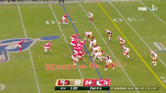
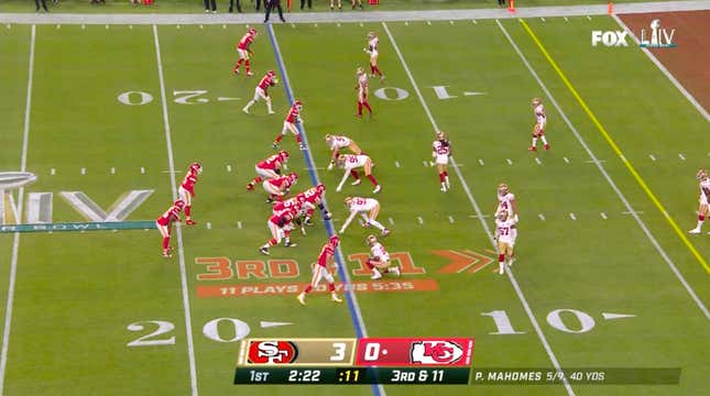
The emphasis on data manifests in the form of a long gray tendril that protrudes from the score box. After each play, it updates the quarterback’s stat line. This is the tendril’s only reason for being. Do not ask more of the tendril.
A quarterback’s progress report is the type of thing that, on most broadcasts, will only flash on the screen from time to time. Fox’s new QB tendril remains on the screen for almost every down. Once again, as it did with the original Fox Box, Fox takes what has traditionally been a transient piece of data and makes it an onscreen fixture.

Sometimes, as seen here, the first tendril is joined by another tendril that features, say, the yardage tally of a running back or a receiver. But the second tendril is not permitted to remain. It enters this plane of existence, it informs us that George Kittle has three receptions for 28 yards, and it dies. Farewell sweet tendril! You were too pure for this world.
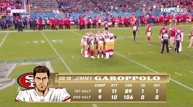
The player cards are a mixed bag. The illustrations are cool. The clean lines of the portraits make them pop, and the artist did a good job of capturing the players’ features—no easy feat, given that they reportedly had to draw 15 players for each NFL team. (I couldn’t find the illustrator’s name. If you know, please drop me a line.) Although the portraits have a superhero feel to them, the players still look human, too. They aren’t monsters. I think it would be cool to feature a variety of artists rather than just this one, but I find it hard to quibble. I’m just happy to see the art of illustration featured on a major-network football broadcast, of all places.
The typography, however, merits a quibble. Every word on the screen bursts with THE FUTURE WOW LASERS ZOOM FAST WOW, except for Jimmy Garoppolo’s last name, which looks like it was hastily cut and pasted from a 1920s boxing poster. Why on earth…? It turns out there is an explanation: As the intrepid reporters at NewscastStudio report, the idea is that each player card is accented with a typeface that references the logo of the team. That’s a neat thought on paper, which is where it probably should have remained.
The on-field down-and-distance marker used to feature an arrow-shaped outline around the type, with the offense’s logo forming the arrow’s “tail.”
The new version drops the logo (instead changing colors to match whichever team has the ball) and loses the arrow outline as well. The 2020 marker is less intrusive, a better match for the actual field markings. It’s not as easy to read as before, but since this is redundant information—the down and distance is clearly printed at the bottom of the screen—legibility is not as crucial. Sometimes, as seen above, a line sprouts below the marker to display the progress of the offense’s drive. This is clutter, but harmless.
I’m fond of Fox Box 2020. This refresh feels like an upgrade across the board—louder and MORE ITALIC to be sure, but with careful consideration of the details. On that note, I’ll conclude with my favorite tiny touch. When a team scores, the readout at the bottom of the screen updates with a cute animation—a floating “+3” that bubbles up and fades into the mist after a field goal, say—as if your character just drank a potion in a role-playing game. I love this. It’s subtle, it’s whimsical, it adds a pleasing note of motion to a pivotal moment in the game—I love it.
Your Super Bowl LIV QuantumPick Result: Reality Prevails
Block & Tackle is the exclusive home of the QuantumPick Apparatus, the only football prediction system that evaluates every possible permutation of a given NFL week to arrive at the true victor in each contest. Put simply, Block & Tackle picks are guaranteed to be correct. When a game’s outcome varies from this column’s prediction, the game is wrong. (Last week: 1-0.)
Congratulations to the Kansas City Chiefs, and an even heartier congratulations to the real winner here, reality. When a football match as auspicious as the Super Bowl aligns with the mathematically proper reality calculated by the QuantumPick Apparatus, it can only have a salutary effect on our timeline. Good work, reality.
Until we meet again
Thus concludes another season of Block & Tackle. Thank you for the warm reception you gave the return of the column this year. And I’m grateful to the A.V. Club staff for having me back one more time—in particular Erik Adams, an editor who gets it, and one of the most knowledgeable and incisive TV critics working today, to boot. Erik, I’m glad to know you.
I don’t know yet what the future holds for B&T, but if you want to keep up with my comings and goings, you can check my Twitter or, heck, you can just send me an email: john at ological.net. It was fun to get emails from so many of you over the season. I’m grateful that you read the column and, in many instances, went so far as to enjoy the column. Goodbye for now. Keep on long snappin’!